CONTRIBUTION
Role: UX Designer, Visual Designer - Individual Project
Duration: 6 days
Toolkit: Whiteboard, Sketch, InVision
Skills: Product analysis, Competitor analysis, User interviews, user flows, storyboards, sketching, paper prototyping, usability testing, interactive digital prototyping, and presenting.
CHALLENGE:
The existing app does not have simple, usable features for different types of users. The app is not at all intuitive and takes a little while before anyone gets used to it.
The main goal of this project was to gain experience with contextual inquiries and information architecture through the conceptual redesign an existing application.
DISCOVER
As the first step, I started to look around to gather information on how I could achieve a better design. I started with user interviews and competitive analysis.
Current App:
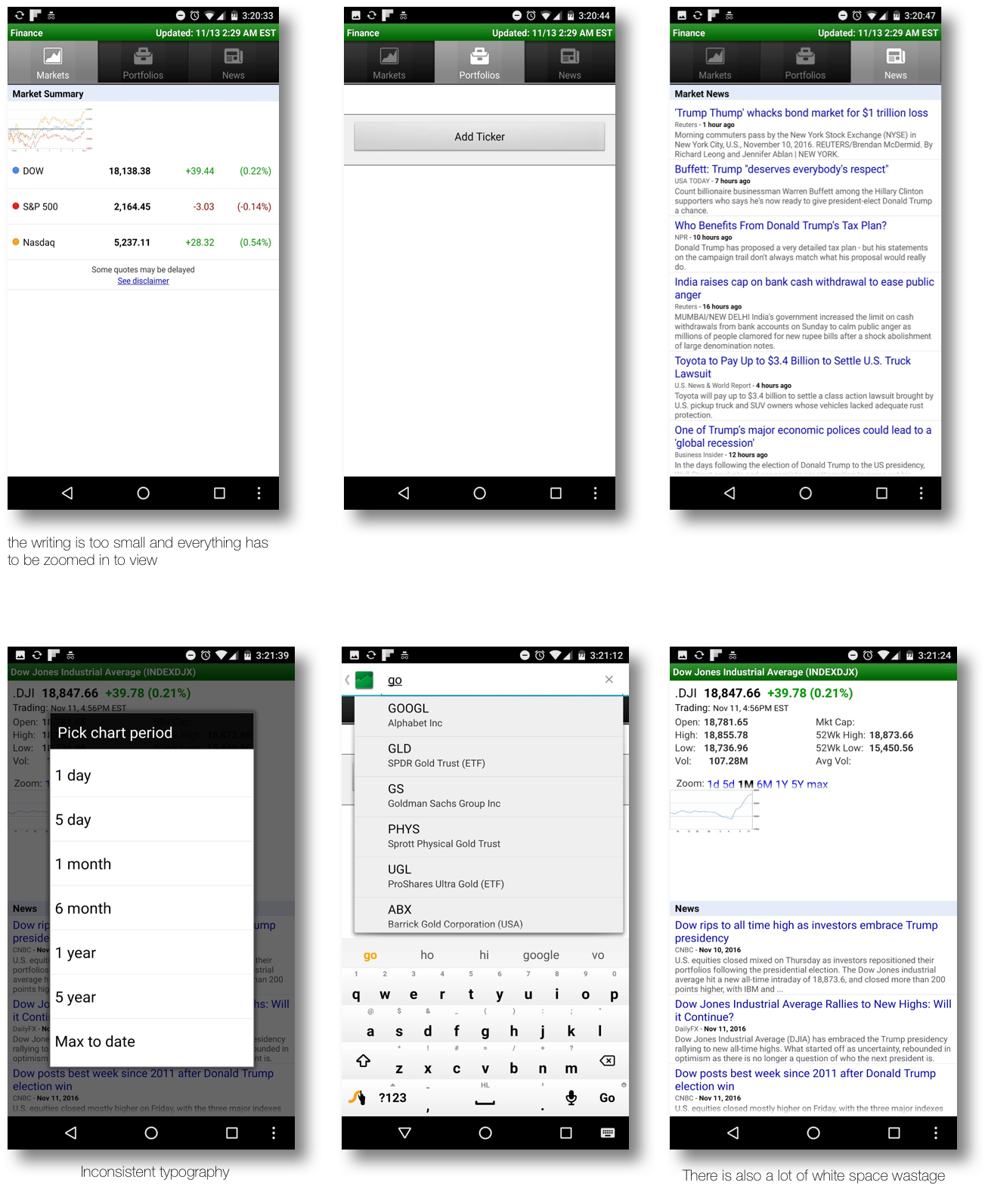
The current app behavior is not so catchy, there is a lot of white space wastage and typography is not consistent. Here are a few screen shots of the current app.
The main methods of research conducted for this project were contextual inquiries and competitive analysis. During my research, I asked 9 participants to complete various tasks on the current finance app and observed to identify the existing pain points on the app.
DEFINE
User Personas:
For this project the main method of research conducted was user interviews. During our interview, the users were asked about what they thought about the app, how they would change it and which financial app do they currently use.
Based on the information received, the personas were drafted.
Key Discoveries:
- The users would like to know the various types of investments offered.
- To check on multiple stocks often with details.
- Meet with financial advisor to assist in decision making.
DESIGN
Wireframes:
The information gathered was very helpful and as a part of next steps, I quickly sketched up my initial problem solution screens so I could begin usability testing based on the following thoughts: App would have the main 3 tabs (STOCKS, NEWS, MARKET) The design shall be such that it should be out there for the users to know where they are The user should also be able to customize things according to their needs.
Once the wireframe was ready, it was the time to create hi-fidelity prototype.
Prototype:
This is the revised version of the prototype after testing and implementing the changes. In this prototype, the user will always know which tab they are in and would be able to go back to the previous screen The functionality is not different than the previous app but it is more clearer and consistent. The user can zoom in on any screens.
These are the 3 main screens - STOCKS, NEWS, MARKET
The below are the sub navigation of the STOCKS tab:
- Detailed view
- Deleting a stock the user doesn’t want to follow
- Moving the sequence of the stocks
- Searching for the stocks to follow
The above final design was created for the users to experience the design and the interaction (clickable prototype here).


